CHALLENGE
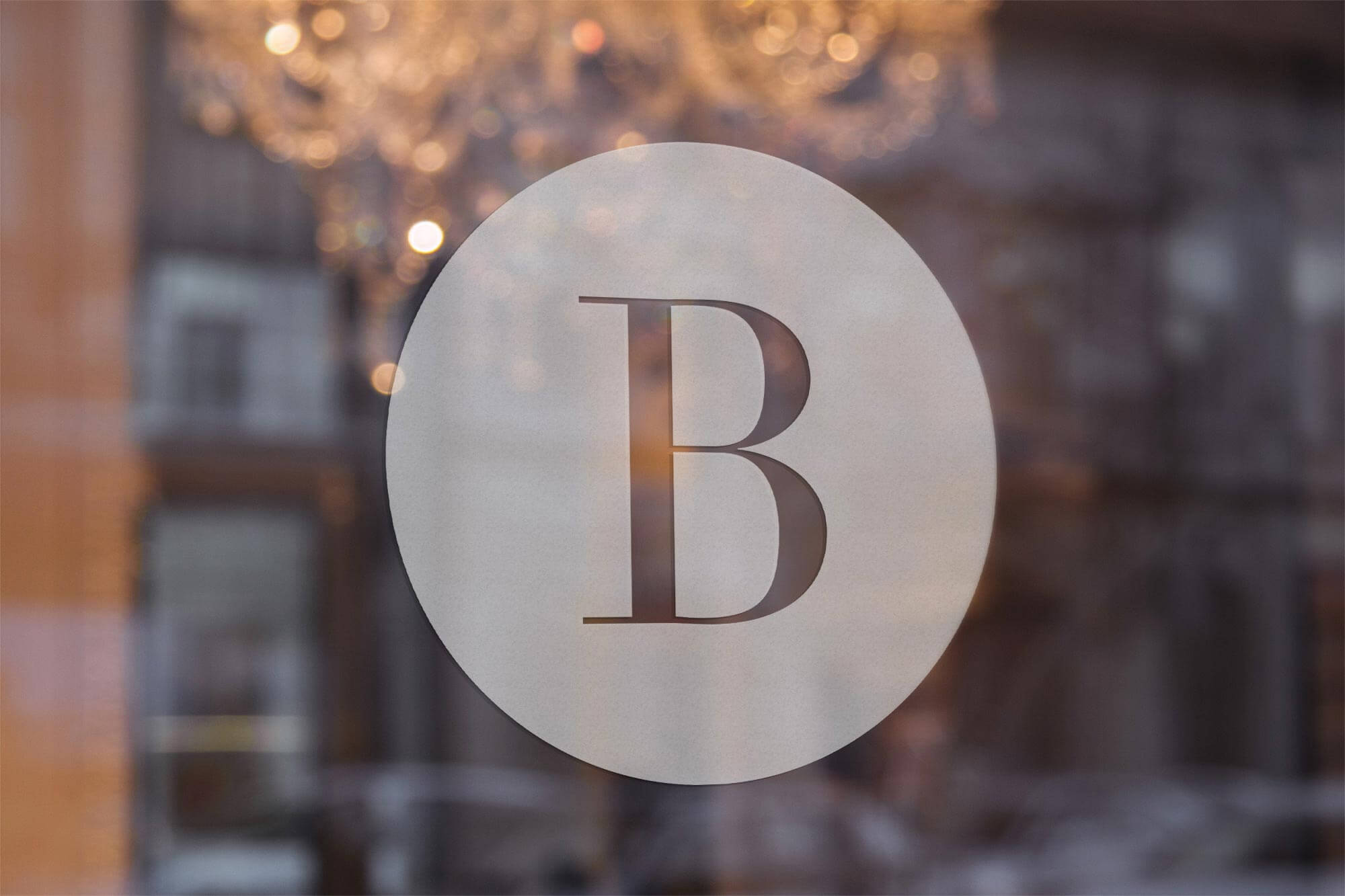
Boulevard Tennis Club was in need of a complete overhaul. They wanted to boost their membership and raise awareness of their club and offerings.
SOLUTION
A clean and classy logo combined with a complete branding package is what Boulevard required. Throw in some amazing pocket folders, brochures and a website, and Boulevard is now at the top of their game.
View Website!
CHALLENGE Rebrand high end development to reflect the quality and prestigiousness of the properties. SOLUTION Use progressive shapes and colors to reflect the demographic of the residences and location. The website features a local amenities map, floor plans and custom site plan renderings.
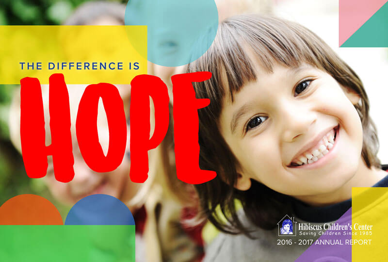
CHALLENGE The Hibiscus Children’s Center strives to maintain a safe shelter for children who are abused, abandoned and neglected by providing prevention, early intervention, and advocacy in quality residential, assessment and recovery programs. With this year’s annual report they wanted to compile their recent successes in a way that reflects their bright outlook for the youths they strive to support. SOLUTION Ironside was able to refresh the Hibiscus Children’s Foundation annual report by providing a colorful and carefree approach to this year’s design.
CHALLENGE Update the John’s Island Club member book with a new fresh feel. SOLUTION Refocused the book design on engaging content with imagery and consistent use of John’s Island branding.
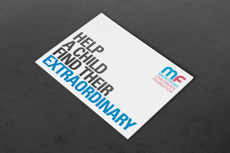
CHALLENGE Mardy Fish Children’s Foundation needed a marketing campaign to increase their donor base. SOLUTION Ironside created an awareness campaign and new website that focused on the emotional connection with the children.
CHALLENGE Update the marketing collateral and web presence to reflect the elegance and sophistication of the spa. SOLUTION Organize content and focus on a clean, modern design utilizing a blue and white color palette with simple, polished photos. Create a seamless experience throughout all marketing and branding so that each piece reflects the soothing feeling of White Orchid Spa itself. New typography was carefully selected to pair with the existing logo and emphasize the overall sleek, contemporary look.
CHALLENGE
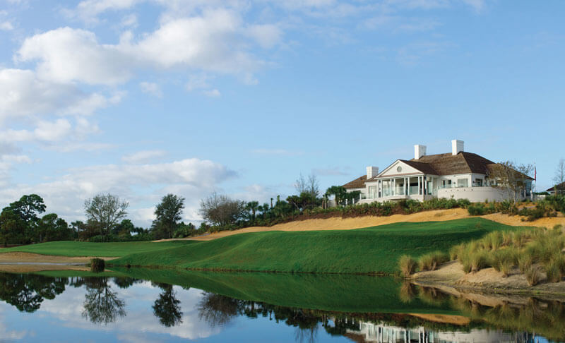
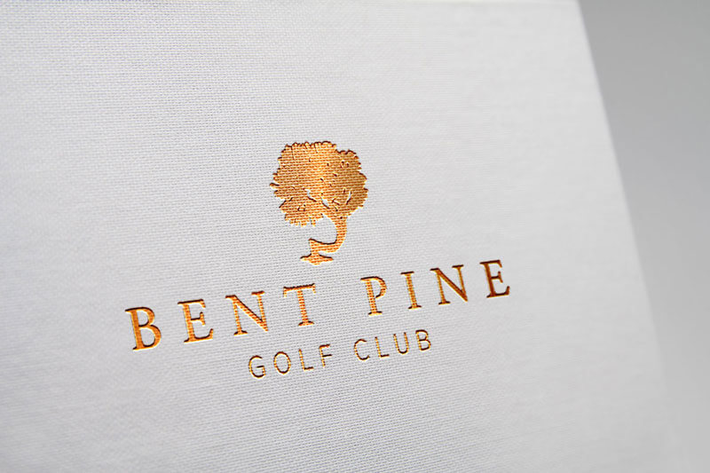
Bent Pine Golf Club came to Ironside in need of increasing their membership base.
SOLUTION
Re-envision the Bent Pine brand to better articulate their existing traditional values and mission, showcasing the grandness of The Club and prestige of membership. Ironside developed a new design language for Bent Pine; coordinating with professional ground and aerial photography and videography, updating their logo, typography, content and incorporating a custom argyle pattern into their new marketing collateral. With powerful branding and a strategic advertising plan, Ironside was able to help Bent Pine reach over 10,000 potential new members.
View Website!
CHALLENGE Brand and market the highest priced property in Indian River County. SOLUTION Charlotte Terry Real Estate knew exactly what they wanted and we helped them turn an amazing property into a breathtaking and iconic estate. Coupled with a brochure, mailer and website, 500 Bay is sure to raise people’s attention.
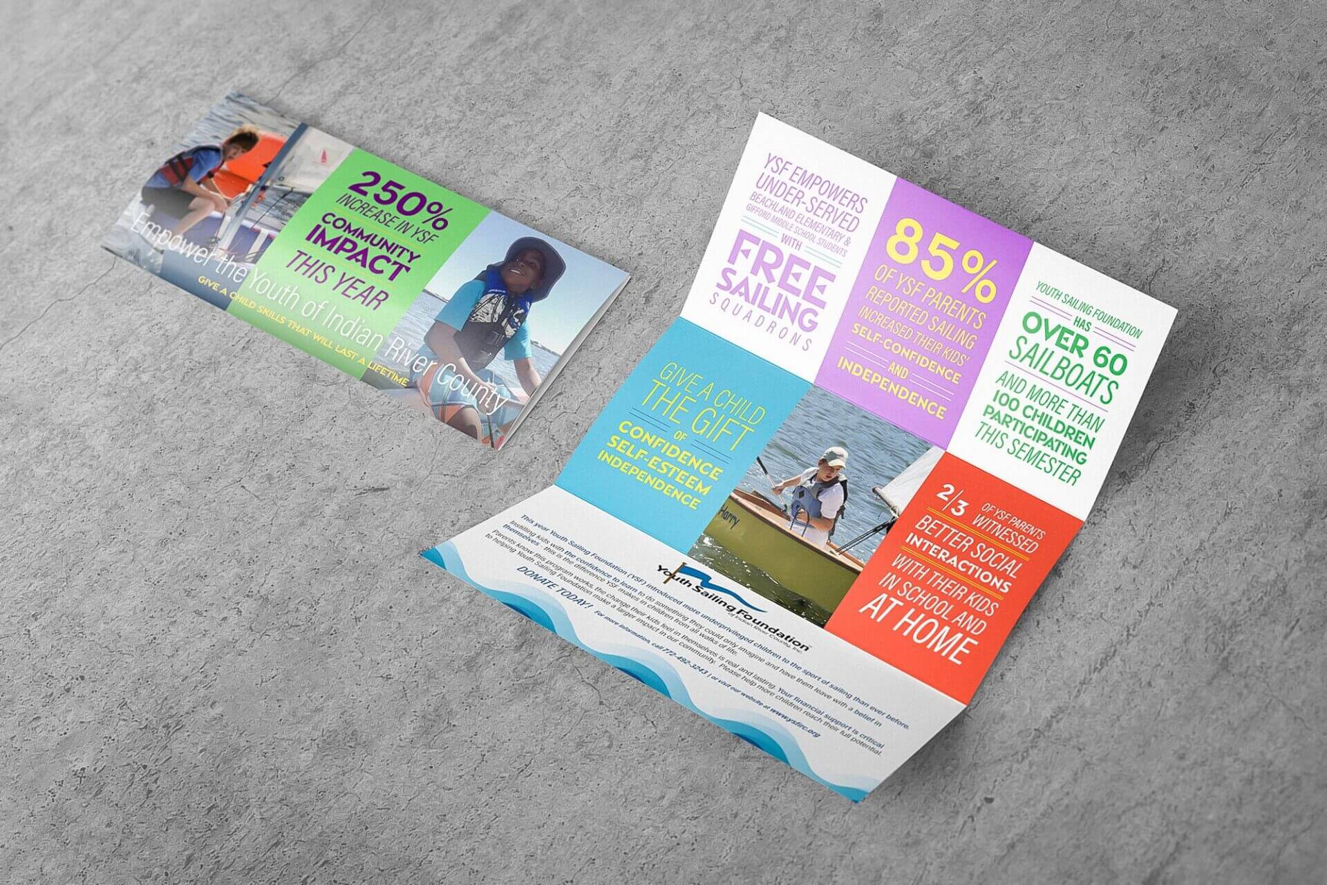
CHALLENGE The Youth Sailing Foundation needed to attract & engage with new potential donors via refreshed marketing collateral. SOLUTION Ironside partnered with the Youth Sailing Foundation to revamp their collateral styling to create a refreshed and dynamic Annual Appeal in order to re-engage potential donors within the community.
CHALLENGE Trinity Episcopal Church needed their annual fund booklet to reflect their mission of community building while glorifying God. SOLUTION Clear messaging and vibrant pictures are at the heart of Trinity's fundraising efforts. Our copywriters worked closely with the Trinity clergy to craft compelling copy and our graphic designers utilized a strong photography portfolio to create the vibrant piece you see here. Printed on Ironside's offset printing press, the finished product was distributed to parishioners at the church's annual meeting.
